Ava W - Developer Journal
Week 7

Workshops + Research
In the workshops this week, we got on with the new task independently in a supportive workshop. On the Tuesday, I spent the morning working on the weather API task coding and the afternoon on exercise 1 – the research.
In the morning, I managed to add a day and night theme dependent on the time of day. This was a fairly easy feature to add to my project, so I decided to try and add clouds for the rest of the morning. I planned this out and managed to add clouds that had attributes relating o cloud coverage and wind speed. After that, I added another slider to represent the UV index. This was fairly easy to do as I added it to the bottom of my page. The final thing I added was a wind direction arrow. This was more difficult as I had to rotate the image towards the correct degrees of the wind direction value. I spoke a little but more about how I managed to do this in my task documentation.
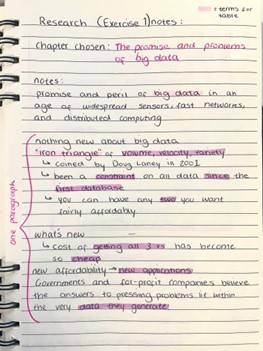
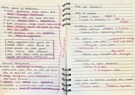
I really enjoyed the research side of this task as one of the chapters we could research was on big data, something I’ve enjoyed learning about before. I read through the chapter making notes on each section and marking down any phrases I might need to define and what’s important to add. As I already knew the basics of big data, I liked learning more in depth about how its used and the problems that come alongside it. I especially enjoyed reading through a research paper on the medicine and health side of big data. I included links to these in my task documentation and my notes on the chapter are below.
In the technical workshop this week we looked at strings and how they can be used. Although I know a lot about strings in C# that doesn’t translate perfectly to JavaScript. This meant I learnt new ways to implement and use strings in my coding.
In the other supportive workshop this week, I started on the documentation of task 1. I copy and pasted parts of my code and commented what they were for. I also created a HTML diagram to show the layout of my weather app.
Lecture
In the lecture this week we learnt about data – abstracting it, where it is, how we can use it, etc. I really enjoyed this lecture as it was more physical and used colouring. We began with maps that we marked with important locations to us. By doing this we could see how each of us deal with data – some of us used colour, some used keys, some used symbols, some used lines. This was really interesting to me as it wasn’t something I even considered when seeing others maps but it is data that is very clear.
We then placed tracing paper over the top and traced over our shapes below. This showed us how data can be abstracted and how we change our ways of representing data when abstracting it like that. After observing this change, we then added names and a way to identify how often we are at a place on the map. I chose to use bar graphs, but some people used numbers or exclamation marks. This was another way to see how we represent data and how it can be gathered in different ways.
At the end of the lecture, we were shown a book called “Dear Data”. Dear Data is a project by Giorgia Lupi and Stefanie Posavec, where they hand draw personal data. I found this really interesting and something I want to do more research into as the way they represent data could allow me to combine art and computing.
https://www.dear-data.com/theproject